Wednesday, February 27, 2008

Shopping in Fredericksburg - red in fred!!

One of my favorite stops when I have the pleasure of shopping our main street is red, a fresh new face on the block. My good friend, Carolyn, manages the store and is the creative genius behind a lot of the store's new, trend setting style. She has a talented staff and is fortunate to also get to work with her two daughters on many projects. Check out the website for more information on these talented women and on the store.

red carries a lot of great new home accessories, dining and occasional tables, chairs, as well as upholstered furniture. Remember, we are a small town, and in the past it was necessary to travel to to San Antonio or Austin to find a variety of design sources.

So, one of the things that is now available here is that anyone, not just designers, can come in and choose a sofa or chair and then choose from a vast assortment of fabrics to custom design their own piece. Of course, designers come in, too, and the staff is happy to meet their needs as well as those of their clients. While the store has a contemporary feel, many of the upholstered pieces can be designed in either a traditional or contemporary style, depending on the fabric chosen.

Carolyn has a long history designing and working for the famous Homestead stores and still consults and occasionally works with Carol Bolton of Homestead and EJ Victor fame. This is a small town and creativity runs rampant here. While the look is completely different from Homestead, and the intent is to be different and fresh, I still see regular local design customers shopping at both stores! It is all about creativity, style, new ideas, and some tried and true ones, too.

red has loads of new, modern pillows, bedding, lighting and accessories, throwing in all kinds of funky, vintage goods, creating a lively mix!

Love the hour glasses and the great zebra pillows behind them.

My weakness - anything faux bois - these are slender little vases of china or porcelain - delicate, and just lovely.

I want the lamp and the mirrored chest beside the chair! Oh, and you can throw in the leopard pillow too! Love it with that blue mixed in the spots!

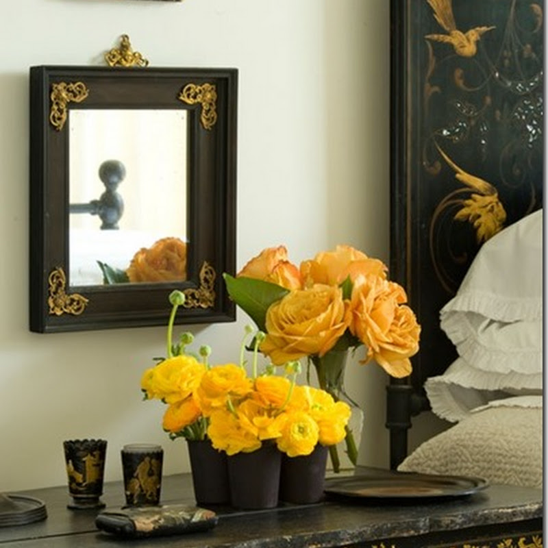
Don't miss the fabulous limestone walls as you are looking at everything else. This is one of the great old historic buildings in Fredericksburg. It was restored for the store on the ground floor and a residence an the second floor. It is one of the prettiest buildings in town.

Oops....... Carolyn was happy that a mirror had just sold before I took this shot, but sorry for the bare spot above the shelf - that's okay, there is still plenty to drool over. Notice all of the great lighting scattered about the store - some modern and some vintage.

A beautiful old chest with a great display of blue items, new and old, and great hanging lights above - so pretty.

Couldn't you just curl up in this big cozy chair for a snooze - the pillows are appliqued with fun, bright fabrics.
Too funny and too cute! The big cushions are made by Fat Boy and the background pieces are old carnival cut outs for photo ops!!

An assortment of goodies and one very cool lamp. The art work above is actually a torn paper collage by Nikki Moore.

Visit red next time you are in the hill country or check out their website and give them a call if you see something you can't live without! I will be back with more shopping in Fredericksburg soon.

Tuesday, February 26, 2008

Yellow Doors and Hill Country Cottages

Before I begin this post, let me encourage you to click on any of the photos that particularly interest you. I have just run through the entire thing and it is amazing how much better you can see these cute little houses up close. I wish I knew how to show you bigger, more detailed photos, but clicking on the photo is the next best thing.

The current color trend in design just keeps popping up everywhere! I have not even had time to enjoy my new March/April Southern Accents but noticed in the table of contents, Decorating: The Color You Need Now.....Daffodil Yellow. It's funny - when I painted my daughter's nursery bright, "daffodil" yellow thirteen years ago, many people thought it was "so bright for a baby"! I have always loved bold color and used it regardless of the trends, but it is fun when something we love becomes fashionable and validated by the "design gurus"!

The photo above is the house I referred to in my last post. I drive by this house frequently and have enjoyed watching the "sprucing up" that has taken place over the last few years. I realized today that the door is not exactly the yellow that is being seen in the current design blogs and magazines, but it is a fresh twist and really great with the charcoal color of the house, black trim, and the crispness of the white fence.


This is an example of some of the old German rock houses still found in Fredericksburg. This house is in disrepair, but the story is that back in the early seventies it was quite a showplace and was featured in Southern Living magazine. It has an addition from the sixties or seventies (you can almost see it over to the right) that is really dated and needs a lot of work. The house is on the market now and someone with a great eye and lots of money to spend on it could make it a fabulous showplace again. Notice the yellow shutters - hmmmm.....maybe we are heading back to gold and avocado -- please no!


Here is another cute cottage that has been completely redone and has tons of charm. I am sorry I decided to do this post before the spring flowers bloom - maybe we will revisit in a few months! All of the houses I photographed today are in about a four or five block area. They are in the historical district of our town and I love it when people take these old cottages and re-do them rather than moving to the numerous housing developments that are sprouting up all around the hill country.


This is another really well done house. It is simple, but freshly painted and well kept. Notice the yellow shutters and great gingerbread trim.


Speaking of yellow, this has been one of my favorites in town for quite some time. It appears to be stucco or plaster and is a yummy,buttery yellow......love it.


Here is a closer shot of the first house. The photo gives the door more of a green tint that it really has, but it is definitely a greenish yellow - crisp and contemporary in feel.


Here is an example of houses being added onto and looking almost like two houses joined by a breezeway. Notice the old limestone used on the right side. This house is next to the green one with yellow shutters and gingerbread trim - actually a beautiful compound that has all been re-done. I will try to photograph it again in the spring with their lovely landscaping - hard to appreciate in February.


Another great example of a little "Sunday house" here in town. People used to have houses that they stayed in on Saturday night when the came from their ranches into town for church on Sunday - or did they stay on Sunday night? Cute and full of charm.


Talk about fun color. I love the combination of this tobacco, mustardy brown with the rosy red doors!

Finally, one of the jewels around town! This house is a fantastic example of the old houses being added on to over the years - again and again. Notice the stucco, the wood, and the German fachwork - a term referring to the building method of using the logs and plaster to creat the cabin looking walls on the right in the photo. This house always has great flowers in all the beds in the spring time - yes, I think I will definitely take another tour in a few months!

Goin' out to look for yellow........

It's almost time to go on that walk to look for yellow.........we'll be back!

Monday, February 25, 2008

Did someone say blogging dogs?

Okay........ so I am a little late to the party, (re: Melissa at The Inspired Room and friends got a little sidetracked about their blogging dogs recently!) but this is Buddy. He is so smart that I am sure he could learn to blog - maybe he could even post when I can't find the time.

Tomorrow we are going to walk by a great old house that has been re-done. I just noticed today that they painted the front door YELLOW - see, I am paying attention! (see Patricia Gray in case you haven't been reading about yellow lately) We will take our camera with us tomorrow. Stay tuned.......

Wednesday, February 6, 2008

Paintings, Pottery, and Pumpkins - Artists Debra Gunter, Otis Dozier, and Ford Ruthling

If you know me, then you know I can get a little tangential at times, especially if I am excited or really interested in something. One thought or idea leads to another and soon I am wondering aloud "Now why am I telling you this?" or "How did I get on that subject?"

So, here is my new painting, still unframed, propped on the mantel, and sharing it with you will lead us into art and fruit and back to Mexican pottery (which I never really finished due to extreme frustration!)

My very talented friend, Debra, is the artist. The painting has been on display, along with other fabulous pieces by Debra and a few other talented artists, at a local bakery and cafe for a while. I fell in love with it months ago and tried to resist buying it (for practical reasons, like my house is full - silly me!) but, alas, it waited for me until I just couldn't resist any longer! If you noticed details in my earlier photos, you may remember a lovely bluebonnet painting hanging over my fireplace. It came with my husband when we married (one of those package deals - he married me AND my daughter; I married him and his animal heads , furniture and HUGE stereo speakers), and while it is a fine painting, it is too predictable and traditional for me, and has been moved to the hallway leading to our bedroom.

Debra's painting is so colorful and full of that Mexican influence that I am drawn to. I love her style and palette.


This is a painting by an old Texas artist named Otis Dozier (1904-1987). He was part of a group called the "Dallas Nine". They were recognized in the 1985 exhibition entitled "Lone Star Regionalism" at the Dallas Museum of Art which payed homage to the abundant and uniquely Texan legacy that this group cultivated and sought to pass on. He has become quite collectible over the years and there is a wealth of information on him as well as the other painters. (I could do an entire post just on this group.) I bought this particular painting from his estate and am very fond of it. It may seem redundant hanging in my living room with Debra's painting, but I love that his was done in the 1970s, in his older years, and hers completed just a year or so ago, in her early years of painting. I seem to be drawn to fruit as subject matter as you will see in my other collections.


Just a glance at a bowl of vintage stone fruit(surprise, Italian, not Mexican!), old blue stone grapes, and a Mexican burnished pot from Tonala. The tin floral arrangement is also vintage Mexican.


As my girls say, "Random, Mom" , but here we go. What do you do when the creative urge hits and you are totally "losing it" with anything related to the computer and you just have to do something new in your own home, right now! (tell me I am not the only one with this disease!) I usually re-arrange furniture or start designing pillows! Last week I was in San Antonio for an art class and had a little time afterwards to wander through a few fabric stores and poke my head into a Pottery Barn.

Let me digress........(see, I told you) A few months back Joni (former sister in law, new friend and blogging queen, Cote de Texas) and I had an email conversation about my frustration with my living room. I moved into this house, threw everything together, and then ran out and bought new pillows - Thomas Paul, big, bright trendy colors - and thought they would mix in with what was already a variety of styles. I wanted to buy something from my friend who had just opened a new shop called "RED" (fabulous store - visit it at www.redinfred.com) and I wanted a breath of fresh air - something different and new. The mix just never felt right, though, and I realized I have to be true to my style, regardless of what is "fresh and new". Joni provided clarity and we talked about tying colors and fabrics together in a room - basic stuff that I forget in my excitement and impulsivity sometimes.

Okay, back to the pillows. I found a great looking, inexpensive cotton/linen woven fabric is a blue and cream animal stripe. Loved it - bought a few yards. When I walked into Pottery Barn I spotted these great floral linen pillows - what do you know! they work perfectly with my new fabric. Talk about immediate gratification! No fabric to order, good looking linen that cost pennies compared to anything in a showroom...........

I got back to Fredericksburg, called one of the workrooms I use, and voila! new pillows. Did I mention the burlap end pillows from Pottery Barn that I added a strip of the blue/cream fabric on to customize the look? For today, I am very happy with the results.


Look! over there in the wing chair......one of the great pillows from "RED" that just doesn't work in my room! It is gone now, and actually the wing chair is going to be slipcovered in a blue and white ticking to get everything back on course with "my style"! (and yes, there is that bluebonnet painting, too)

Oops - there I went again. I actually took this photo to show you the Mexican fruit banks in the old carved wooden bowl on the coffee table. (Surprise, those are old Mexican tin candlesticks on the table too!) The fruit banks are from the 1920s -1940s and are from Tlaquepaque, Mexico.


These vases are some of my absolute favorites! When I was first attracted to this pottery, someone called it "Mexican majolica". I don't think that is any sort of official name, but the glaze is similar to English and French majolica, as I mentioned in a previous post. This is referred to as drip ware in the books on the subject, and is from Oaxaca. I am crazy about the applied flowers on the vases!


This is the photo of the plate rack in my breakfast room that just refused to publish the last time I discussed Mexican pottery. It is a mix of old and new pottery from different regions. I have gathered these pieces for years from all over the place. At times I have grouped my pottery by color, sometimes by style and region and sometimes by function - like all of the teapots together on a shelf or in a hutch. I thought about regrouping for this post, but decided to keep my pictures and information general at this time.


Finally, I plan to surround this original print ("Cows Have an Inner Light" / "Remembering my Grandmother - Frieda Maurer") by Ford Ruthling , 2001, of Santa Fe, N.M. with Mexican plates. I have not finished, but wanted to include the photo of my upstairs hallway, painted in bright melon and home to yet more colorful, vintage drip ware from Oaxaca, Mexico!

If you are interested in learning more about Mexican folk art or any of the artists I have featured, I am happy to refer you to great educational sources for more information. Just let me hear from you!

LinkWithin

Related Posts with Thumbnails