You may remember when I posted about my frustration with my kitchen here.
I was contemplating painting our kitchen cabinetry and asked for thoughts and opinions.
I sure got some! Most people screamed messages loud and clear like :
"Paint them!! It's your house - do what you want!!"
Others scolded me for even thinking of painting the rare and cherished antique long leaf pine.
My issue was, and still is, that all of the cabinetry is long leaf pine - I mean ALL of the wood work all over the house; the doors, the kitchen cabinets, the bathroom cabinets, the upstairs built in desks and shelving, the built in dressers in the closets, the frames around bathroom mirrors all over the house - all perfectly lovely and custom designed and expensive.
One problem - it's just too much wood for me.
It's no secret that I am a color girl. I love color. I can appreciate all of the gorgeous designs in creams and putty and grays, and can always see the beauty in all white decors.......lots of shades of white and cream can be just beautiful. But, when I get right down to it, color is what makes my heart beat a little faster!
These kitchens just speak to me, make me happy and feel like me.
Does that make sense?
I considered a look like this for my kitchen.
While I might not choose black granite counter tops, the fact is that I have them, and painting the cabinets would have really brightened up my kitchen with a whole new look. I also love the painted floor and may still do that at some point.
I am crazy about the feel of this kitchen, and it is rather a compromise between neutral cabinetry and color added in the chairs and rugs.
Oh well, all dreaming aside, I realized that I needed to do something in my kitchen that would brighten it up without compromising the integrity and specific design of a Texas hill country house.
There are those who worship the limestone, the old wood floors and the long leaf pine.The house is for sale and someone will love all these indigenous materials.
I had to do something purely decorative that did not change materials permanently.
Painting cabinetry, changing tile back splashes, changing granite counter tops - all out of the question.
Adding some color and softness to the room using fabric, brightening the room with a new fixture and better light......these were do-able!
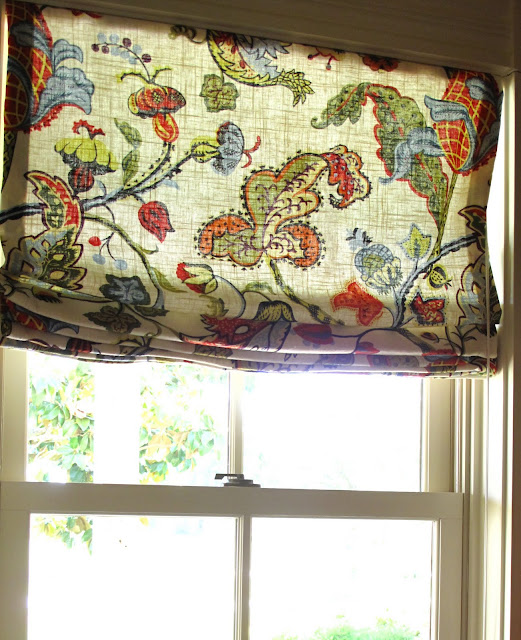
I have long been a fan of this pattern - Joseph Frank's Vegetable Tree, as well as some others like it.
I found my fabric at Calico Corners and at several online shops.
It is a close look to the more expensive ones, (which I adore, but too pricey for a house we are leaving) and fits my budget for this house.
And, it is very colorful!
I also like the white linen background for the light to filter through.
I knew, too, that changing out the light fixture could add more light and give the space a fresher, updated look. The original fixture was a very nice custom iron piece, but the light shone straight down on the island and did not add light to the entire space at all.
Here is a really close shot of the new fixture. It like it because it is not too contemporary for the house, but has clean, modern lines, and gives my kitchen a ton more light!
The light shines up and down, illuminating the island and the ceiling beams, while brightening the overall kitchen.
The light shines up and down, illuminating the island and the ceiling beams, while brightening the overall kitchen.
I added Roman shades to the large window above the sink as well as to the two smaller windows flanking the stove alcove.
Finally, I changed the fabric on the window seats and cafe curtains in the morning room. I like them - they tie in to the kitchen nicely.
So, there you have it. My fix for awhile.....at least until I can design my new kitchen, which might just look something like this:
Yummy blue....... or this fun green.............
or this barrel ceiling, with this amazing and gorgeous design!!
I like the French favorite of so many bloggers out there.......it's just plain pretty.
This is nice and fresh looking.....
as are the red and white tile in a checkerboard pattern.....
a little modern for me, but great color.............
Last but not least by any means, I absolutely adore this one - love the tile work all the way up and the blue background to the cabinets. Move me right in!!
The last 8 images courtesy of House Beautiful


hi Ann! I love how two relatively simple (i.e. not painting;) changes added so much to the space! I love the new light fixture and fabric- perfect solution! Now, here's to a "sold" sign:)
ReplyDeletexxjoan
such a charming print on your fabric selection, just perfect for your kitchen. At least until you choose to do something far more extensive. But I love the way it looks now :)
ReplyDeleteI've been considering changing the tile in my kitchen backsplash and in the butler's pantry.
Just not sure about how to select.... I'll think about it later. Someday.
Hope you're having a wonderful week. ~diane
I love what you've done so far- it looks great!
ReplyDeleteI'm thinking it's going to be hard to beat that kitchen!! I love the fabric!!
ReplyDeleteLooks great! Charming print on your fabric selection!
ReplyDeleteSilver MLM
What great solutions! Your kitchen looks beautiful and will be appealing to potential buyers as well.
ReplyDeleteWhat ever you do it will look great!
ReplyDeleteChange is good right?
xo kelley
love the changes Ann!
ReplyDeleteWe're in the process of moving and just now catching up quickly on some blog reading..
great fabric choice and lighting!
I have just found your blog, LOVE the light fixture and the fabric. I am a woodworker and did breathe a sigh of relief when you left the pine natural...whew.
ReplyDeleteWow! That was fun, looking at all those kitchens. You did a great job lightening yours up with fabric. I love your window seat. I feel the same way about color - it speaks to me. My cottage is mostly different shades of white but I kept a lot of the tops of built-in's wood stained and I think it ties in nicely. I use the white as a palate to pop color off of. I love your blog, nice to meet ay.
ReplyDeleteP.S. My daughter Kate went to school in Texas (Dallas), and met her future husband there. They are going to live here in San Diego though because my girl doesn't like to live so far from her surf board.
LOVE the fabric! Cute light fixture too.
ReplyDeleteI love everything about your kitchen, cabinets,
floors, walls. Its wonderful! You are one blessed Hill Country house gal.
My favorite room in the house is the kitchen! I love seeing all the photos you posted for inspiration. And I love the fabric you chose for your window seat and cushions! What a nice change, perhaps the perfect compromise for you, too!
ReplyDelete