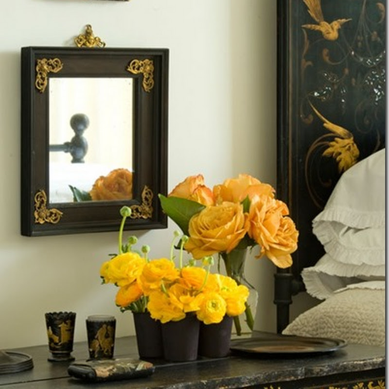
I was just perusing my latest email from House Beautiful and love the home of stylist Peter Frank!
His home SO appeals to my aesthetic. I just love it!
I remember loving this room a while back - maybe in one of my House Beautiful magazines, but for some reason today it just resonates with me even more so.
House Beautiful refers to it as a "mad mix of antiques and modern furniture...." and tells the reader to check out " his quirky decorating style".
Oh they speak my language!
To see more of Peter Frank's work, go here.


I wouldn't want to over-analyze Frank's work, but it's interesting that his rooms are very full and yet have the feel of minimalism. How he groups things and the colors he uses add up to a feel that is both elegant and homey.
ReplyDeleteI love this room. I love your aesthetic. I like that this room had some nods to history and folk art but it didn't look like a museum, although I like houses that look that way, too. I just can't imagine my family living in them.
ReplyDeleteI love it. He has such a way of putting things together. Love the color, casual vibe, and restraint. Nothing's overdone.
ReplyDeleteVery casual and comfy looking, yet with purpose. I love symmetry, the planking on the walls...it all just works beautifully.
ReplyDeleteLove the warm and inviting feel of these rooms...beautiful!!
ReplyDeleteI gotta say, the grey wall color in the photos captured my attention - I think it's the same as mine (or close to). I'm in love with soft grey right now... goes great with both soft tones and vibrant pops of color.
ReplyDeleteI'm in San Antonio, by the way - nice to "see" another central Texas blogger! Love your posts. :)
Here's mine, I've just started blogging, I'd love your feedback!
http://sanantoniomurals.blogspot.com
Thanks for your blog, Ann!